HOWE Candy Packaging Redesign
Bringing a Legacy Candy Brand Into a More Playful, Contemporary WorldHOWE has been satisfying cravings since 1927, with a long history spanning coffee, nuts, and candy. The challenge was to create packaging that honored that heritage while giving the candy line a more colorful, energetic, and recognizable presence on the shelf.
The Approach
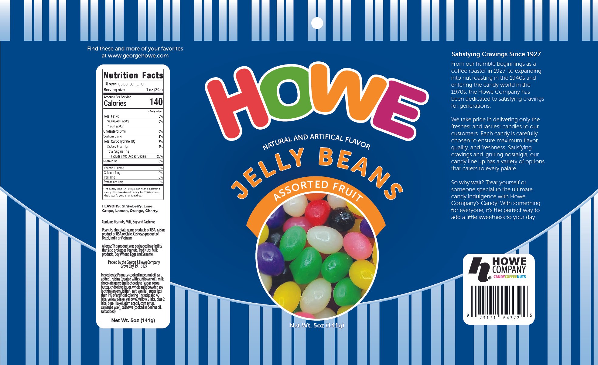
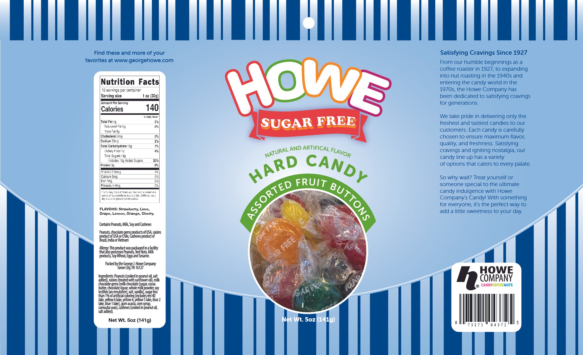
I developed a packaging system built around HOWE’s playful personality and the natural visual appeal of the candy itself. A bold blue field provides a consistent foundation across the line, while the colorful HOWE wordmark creates an immediate brand signature.
Curved typography, bright accent colors, and prominent product photography give each package a sense of energy and appetite appeal. The design also creates a clear hierarchy between the HOWE brand, product name, flavor information, and the candy itself, making the products easy to identify while maintaining consistency across different varieties.
The system was designed to flex across products—from Sugar Free Assorted Fruit Buttons to Assorted Fruit Jelly Beans—while retaining a cohesive family look.
The Result
The redesign gives HOWE a more contemporary and distinctive visual presence while preserving the brand’s personality and long history. The resulting packaging system creates stronger shelf recognition, makes the product more visually engaging, and provides a flexible foundation for expanding the candy portfolio.
My Role: Brand strategy, art direction, packaging design, visual identity, and production.